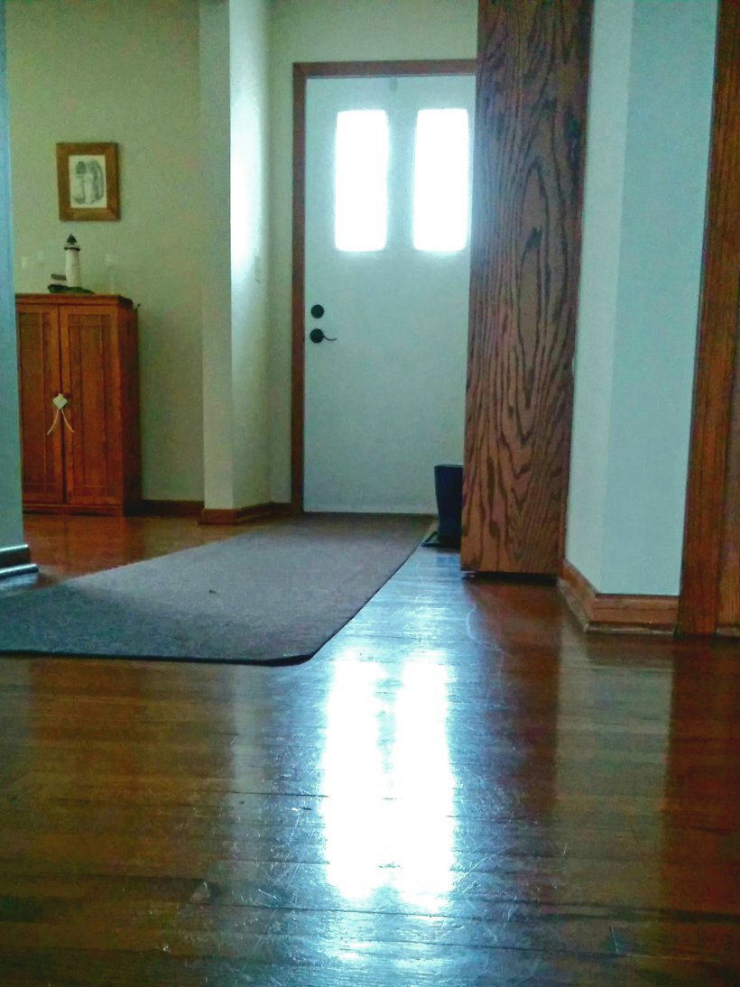
When we bought our first home, we had a lot of dreams. One thing that I couldn’t really change though was the entrance size. It was narrow and tight and the previous owners had painted it a tan color which seemed to magnify the smallness of the space.
Here’s a poorly taken picture to magnify the awfulness of the space. 😉
Because of the floor layout, we couldn’t knock down walls and open up the entrance. One because there was a bedroom on the right and on the left a small weird partial wall which would then create a gap in the beautiful hardwood. I decided I needed to trick the eye and convince people they were seeing a larger area.
Choose the Right Paint Color and Sheen for the Space
The first plan was to lighten the room with paint. The colors you pick can make a dramatic impact on the look of a home. Warm colors do make a room feel – well warm, but they can also make it feel small. If you don’t have a lot of room to start with, warm and/or dark colors might not be the choice for you.
Dark colors, can add a dramatic effect. Add pops of contrasting color, like a large painting or wide trim in a light color, can still trick the eye into not noticing a small space. In general though, lighter colors and natural light help increase the feeling of openness.
Play with different paint sheens. Flat paint absorbes light and is good for theater or bedrooms. Eggshell, satin, semi gloss and, gloss reflect light at a range of levels and hold up to washing better the glossier it gets. Usually people use a higher sheen on trim, like satin or semigloss and a lower sheen on walls like eggshell.
For more paint sheen information click here.
Use Texture to Create Height
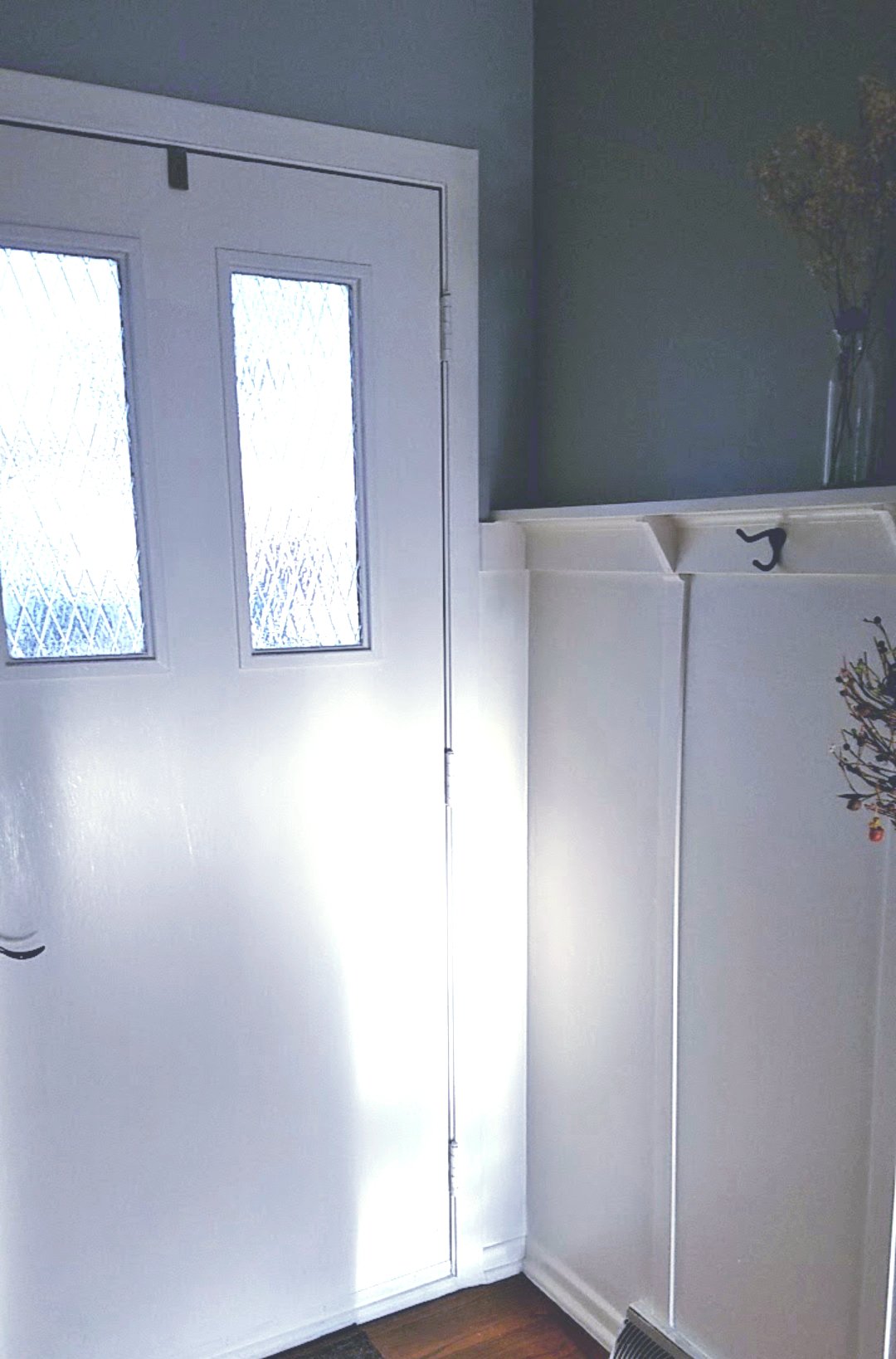
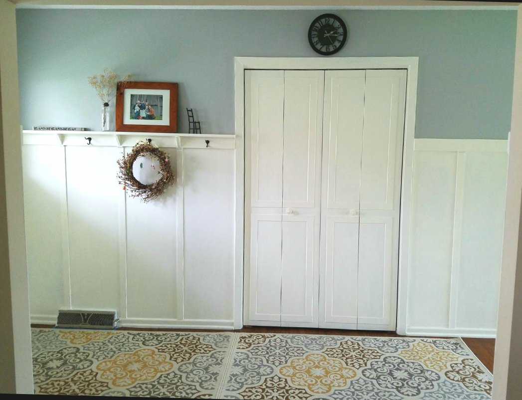
I threw in some texture to lift the eyes and create a feeling of height. To accomplish this I created faux wainscoting that came slightly above 5 feet.
When you entered the home the height of the trim made you feel like there was alot of head room.
It also made the perfect height for a small hook rack for purses, jackets etc.
Use Texture to Keep the Eye Focused
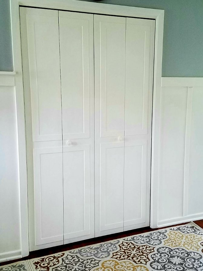
I trimmed out my flat, boring accordion closet doors to create interest and pull attention away from the narrow entrance.
The trim was cut to span more than one door, creating the effect of two larger doors instead of four small ones.
Then I painted the trim, doors and walls of my new fake 🙂 wainscoting up to the top rail in a nice creamy Apple Core from Behr in a satin sheen. Above the wainscoting I picked a gray blue paint in eggshell.
Use Contrast to Pull the Eye Upward
You’ll notice I put the darker color above the light color. You would think this creates a heavy feeling making it seem small, but actually it’s the opposite.
By creating something eye catching up high, it causes you to look up and makes the room seem larger than it is.
Create a Focal Area that Might Otherwise be Ignored
Another trick is to pull your gaze through the room with a focal point.
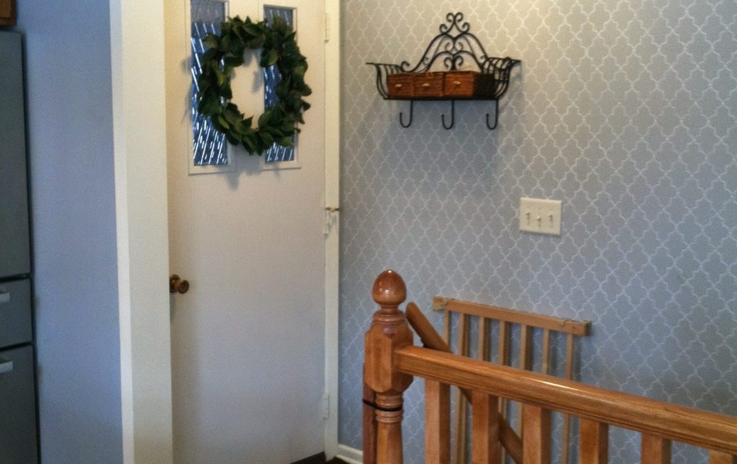
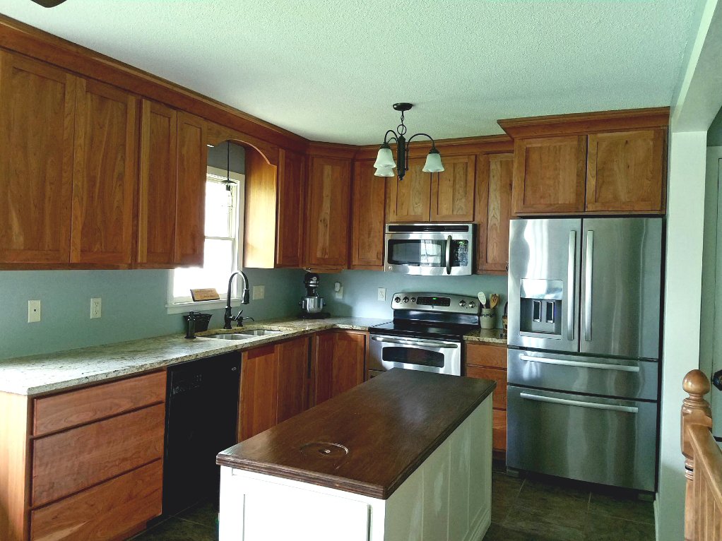
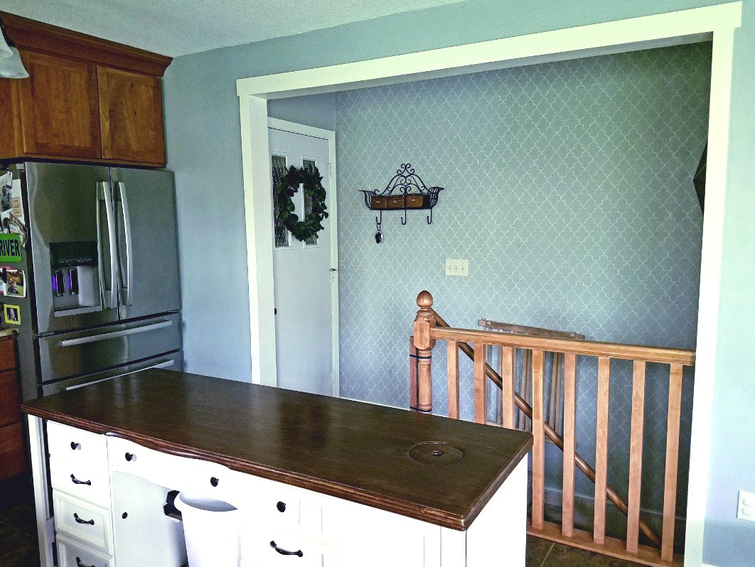
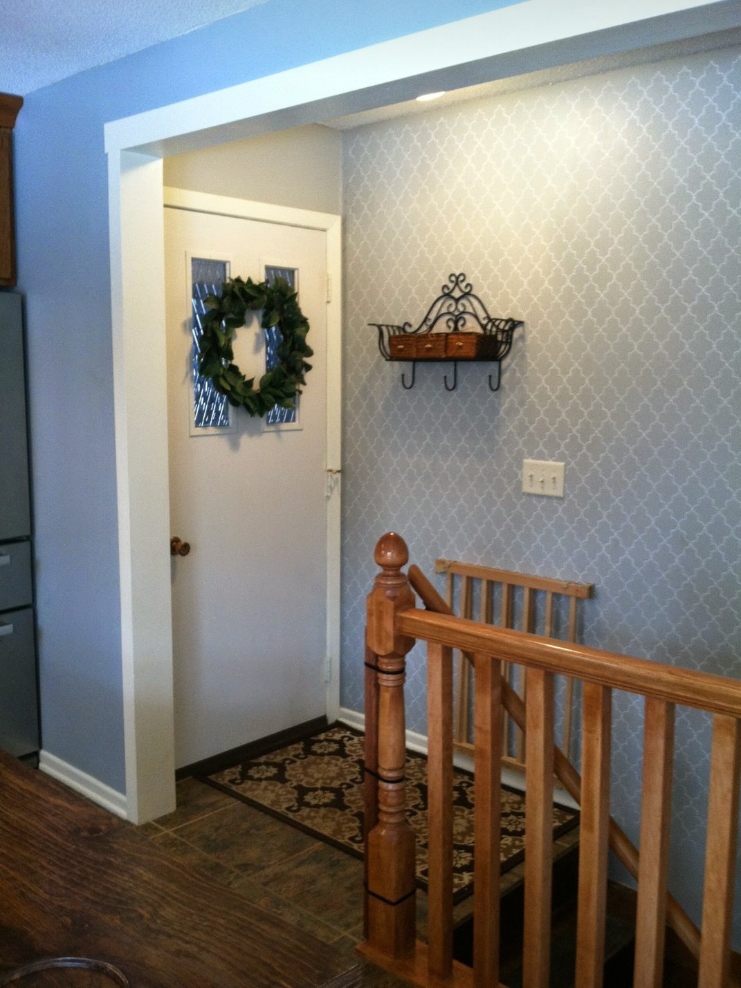
Our home also came with a narrow kitchen surprise, surprise. We were able to knock out a partial wall to open up the kitchen a bit over the stairway, but it still needed help. I decided to add texture to my trouble wall and make it the focal point.
This was accomplished by stenciling the wall with a light gray semi-gloss over a misty darker blue/gray in eggshell.
This wall became my favorite and went above and beyond what I was hoping. Friends always commented on the wall and with it being right at the entrance from our garage it was a nice welcome home after a long day.
Use Reflection to Imitate Space
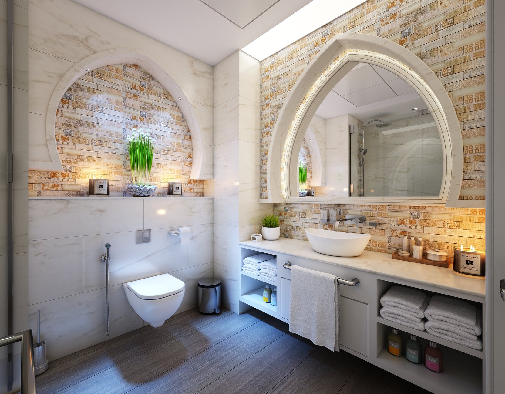
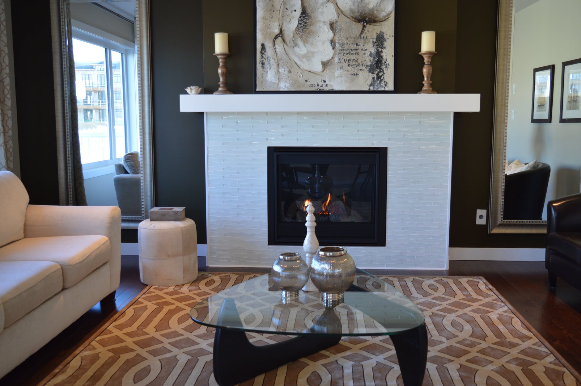
Another trick is to add a large mirror in a prominent location, over the fireplace or as a focal point of a room. It’s a great way to elongate a small space and create the effect of a larger space.
In this case the mirror looks like a window and reflects what looks like another room. Though logically we know it’s a mirror it still create a larger, spacial feeling.
A well placed mirror can also reflect natural light creating the feeling of several windows when the room may only have one.
What have you done to make a room seem larger?
Which room in your house do you want to use these tricks on?



I love how you transformed this entryway! Well done, with a nice choice of colors. I want to make my entry room a mud room/closet area using the white painted paneling.
You will love it and it’s fairly easy to do. I can’t wait to see yours. 😊
Your house is coming along really nice. I love the paint colors. Cute entry way. I like the use of mirrors in a room to give it the feeling that the room is larger than it appears.
Thank you Deb. ❤️ There is never a dull moment ☺️
I always love the idea of making a space seem bigger than it is. Color is everything!! It makes a big difference depending on the amount of natural lighting you have as well. I like how there are so many different ways to make a room POP. I haven’t done this before but I know I would LOVE to in the future :).
Nancy ♥ exquisitely.me
I LOVE color – it’s magical. ☺️